Summary The toll of deaths and other consequences Deaths per day New cases per day UK "Global Death Comparison" chart UK nation and regional comparisons Poor UK Government decision making NHS/PHE labs are being denied testing reagents Unspecified case location in 70% of UK cases Problems with the covid-19 science Problems with the media and covid-19 Reasons to be concerned Reporting delays in Liverpool for covid-19 tests Action needed Elimination of the virus ("Zero covid") Elimination successes Population ("herd") immunity Countries with the best covid-19 control: half-lives of 5 days When to end the UK lockdown Predicting epidemics - Q and A R values, doubling times and halving times Data sources Data sources for covid-19.php Seven principles of public life in the UK Myths and misinformation About
Predicting epidemics - Q and A
How do scientists predict the growth of the covid-19 epidemic?
From the start of the epidemic, the covid-19 epidemic has behaved in a predictable way, until the introduction of restrictions.Put simply, each case infects about three other people on average, and the time from one person being infected to that person infecting three other people is about 5 days.
So one initial case leads to three new cases 5 days later. Each of these three cases infects three new cases 5 days later - so that's 9 cases after 10 days. The process continues with number of new cases tripling every 5 days. See a YouTube 3 min video for a demonstration of the process at https://www.youtube.com/watch?v=xUVERo2xpH4.
The tripling of new cases every 5 days is roughly the same as a doubling every 3 days.
With doubling every 3 days, the number of new cases grows very rapidly:
| day | 0 | 3 | 6 | 9 | 12 | 15 | 18 | 21 | 24 | 27 | 30 | 45 | 60 |
| new cases | 1 | 2 | 4 | 8 | 16 | 32 | 64 | 125 | 250 | 500 | 1,000 | 30,000 | 1 million |
Once restrictions are introduced by governments, or the population starts changing behaviour anyway, the growth slows.
Why do scientists use logarithmic scales on charts?
There's a big problem showing epidemics on an ordinary graph where the y-axis scale has equal steps (a linear scale) - either the scale shows the small numbers and the big ones are off the top of the chart, or the scale shows the big numbers well, and the detail in the small numbers is lost.
The problem is solved by using a logarithmic scale for the y-axis - where equal steps up the y-axis are the same ratio rather than the same difference - so the tags on the y-axis might be e.g 10, 100, 1000, 10,000 rather than e.g. 10, 20, 30, 40, or as in the above example from the Financial Times website.
How do scientists/doctors/epidemiologists predict the growth of epidemics?
When the numbers of cases in an epidemic are plotted on a logarithmic chart, the plot will be a straight line, and projections can be made by extrapolating the line. This is a mathematical process of calculating how fast the epidemic is increasing by working out the doubling time, and then using this doubling time to calculate the number of cases at any point in the future if the epidemic continue to spread at the same rate. Hopefully, effective action will slow the spread and the numbers of cases will be less than projected.How good are predictions?
This is one example - reported deaths in the UK from covid-19.The data is taken from https://coronavirus.data.gov.uk/deaths, and the dataset plotted is the deaths within 28 days of positive test by date reported. Smoothing is by a 7-day rolling average.
These four charts have been posted on Twitter:
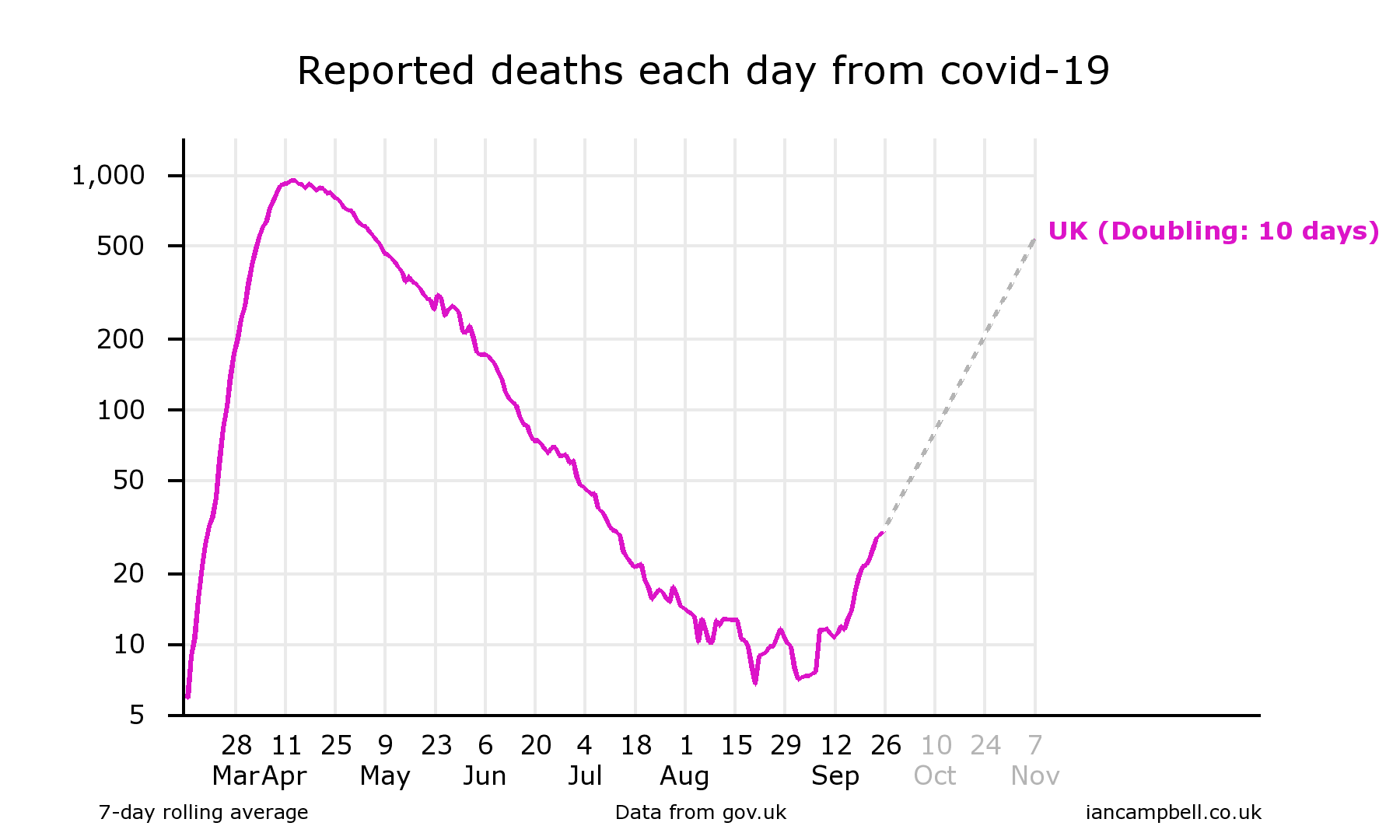
(Sep 26) https://twitter.com/Ian_Campbell_/status/1309906513239121920
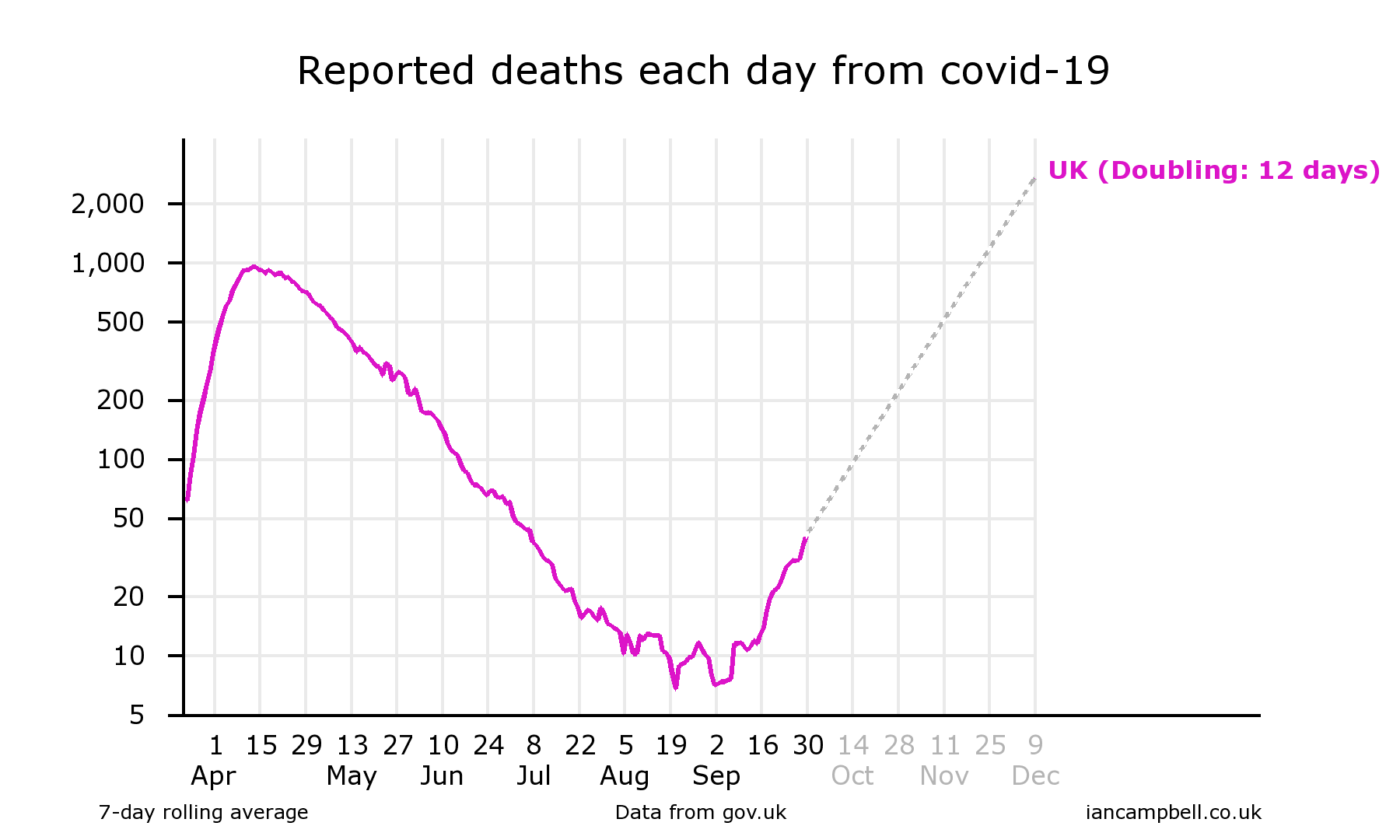
(Sep 30) https://twitter.com/Ian_Campbell_/status/1311385398682300418
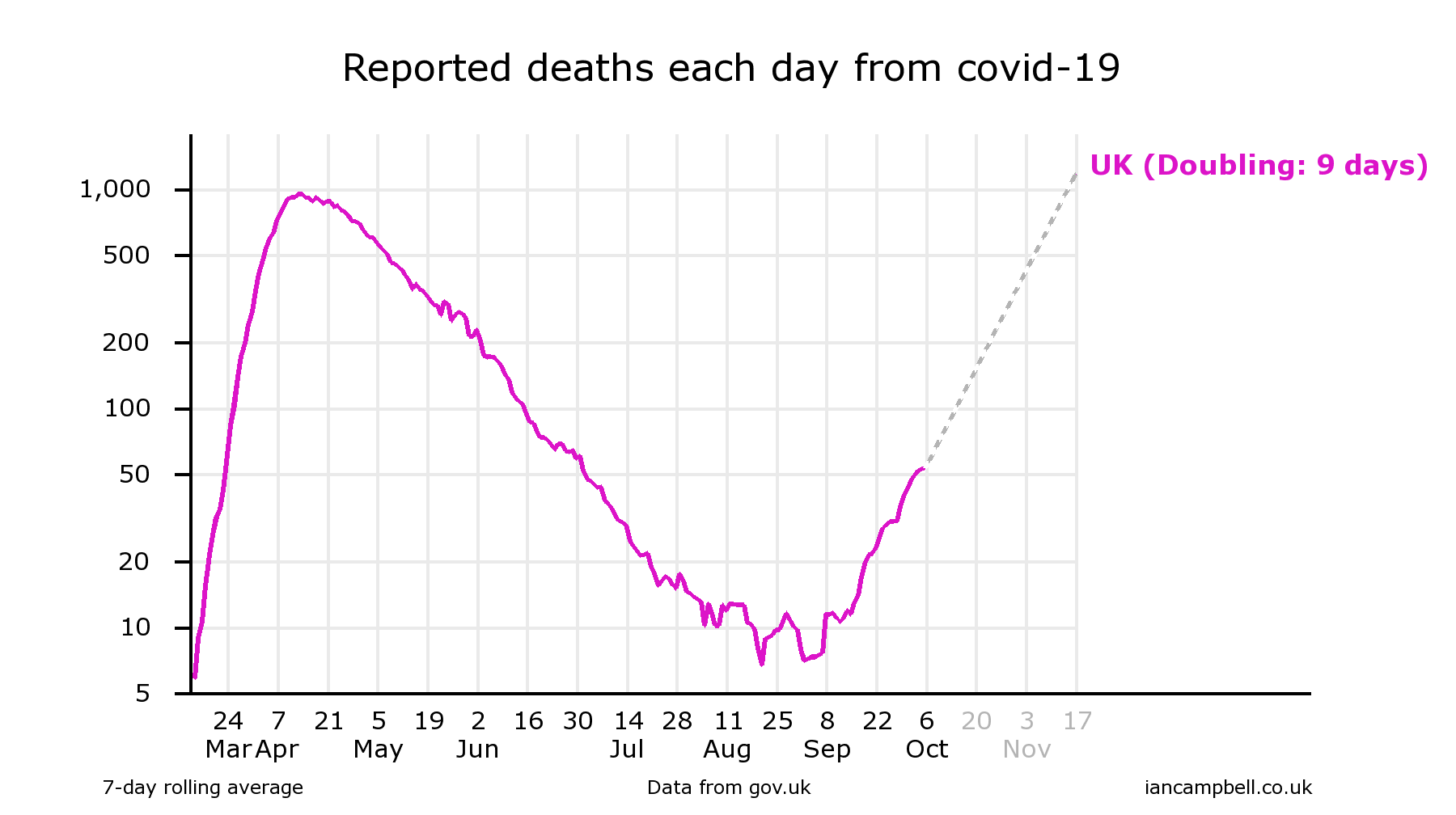
(Oct 6) https://twitter.com/Ian_Campbell_/status/1313535232671387653
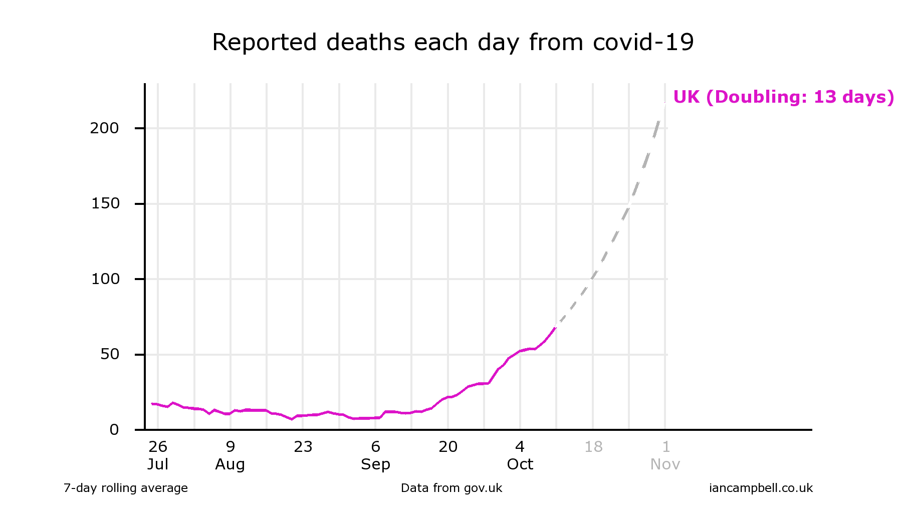
(Oct 11) https://twitter.com/Ian_Campbell_/status/1315342375515029504
In each case, the chart drawing software (at https://www.iancampbell.co.uk/covid-19.php) calculated the doubling time over the previous 4 weeks, and added an extrapolation of the data (shown dotted).
Reading from the charts gives projections for the value of reported deaths on 25 October of 220, 180, 220, 150 respectively.
The actual value was 180, which falls within the range of projections. This might be regarded as evidence of success of the projections, but it is really a failure of the scientific process to influence decision making sufficiently to influence the course of the epidemic.
Further information
- More technical video (Exponential growth and epidemics): https://www.youtube.com/watch?v=Kas0tIxDvrg
- Exponential growth bias: The numerical error behind Covid-19 (Aug 2020) https://www.bbc.com/future/article/20200812-exponential-growth-bias-the-numerical-error-behind-covid-19
- Wikipedia Logarithmic scale: https://en.wikipedia.org/wiki/Logarithmic_scale
- Financial Times tracker and John Burn-Murdoch: https://ig.ft.com/coronavirus-chart/?areas=gbr&areasRegional=usny&areasRegional=usca&areasRegional=usfl&areasRegional=ustx&byDate=1&cumulative=0&logScale=1&perMillion=0&values=deaths and https://twitter.com/jburnmurdoch
First published: 16 Oct 2020
Last updated: 29 Oct 2020
Summary The toll of deaths and other consequences Deaths per day New cases per day UK "Global Death Comparison" chart UK nation and regional comparisons Poor UK Government decision making NHS/PHE labs are being denied testing reagents Unspecified case location in 70% of UK cases Problems with the covid-19 science Problems with the media and covid-19 Reasons to be concerned Reporting delays in Liverpool for covid-19 tests Action needed Elimination of the virus ("Zero covid") Elimination successes Population ("herd") immunity Countries with the best covid-19 control: half-lives of 5 days When to end the UK lockdown Predicting epidemics - Q and A R values, doubling times and halving times Data sources Data sources for covid-19.php Seven principles of public life in the UK Myths and misinformation About