Summary The toll of deaths and other consequences Deaths per day New cases per day UK "Global Death Comparison" chart UK nation and regional comparisons Poor UK Government decision making NHS/PHE labs are being denied testing reagents Unspecified case location in 70% of UK cases Problems with the covid-19 science Problems with the media and covid-19 Reasons to be concerned Reporting delays in Liverpool for covid-19 tests Action needed Elimination of the virus ("Zero covid") Elimination successes Population ("herd") immunity Countries with the best covid-19 control: half-lives of 5 days When to end the UK lockdown Predicting epidemics - Q and A R values, doubling times and halving times Data sources Data sources for covid-19.php Seven principles of public life in the UK Myths and misinformation About
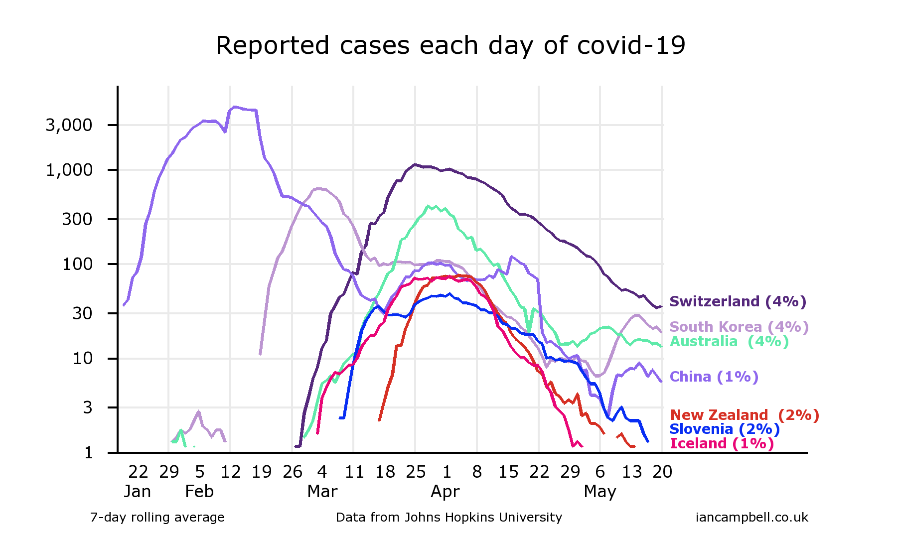
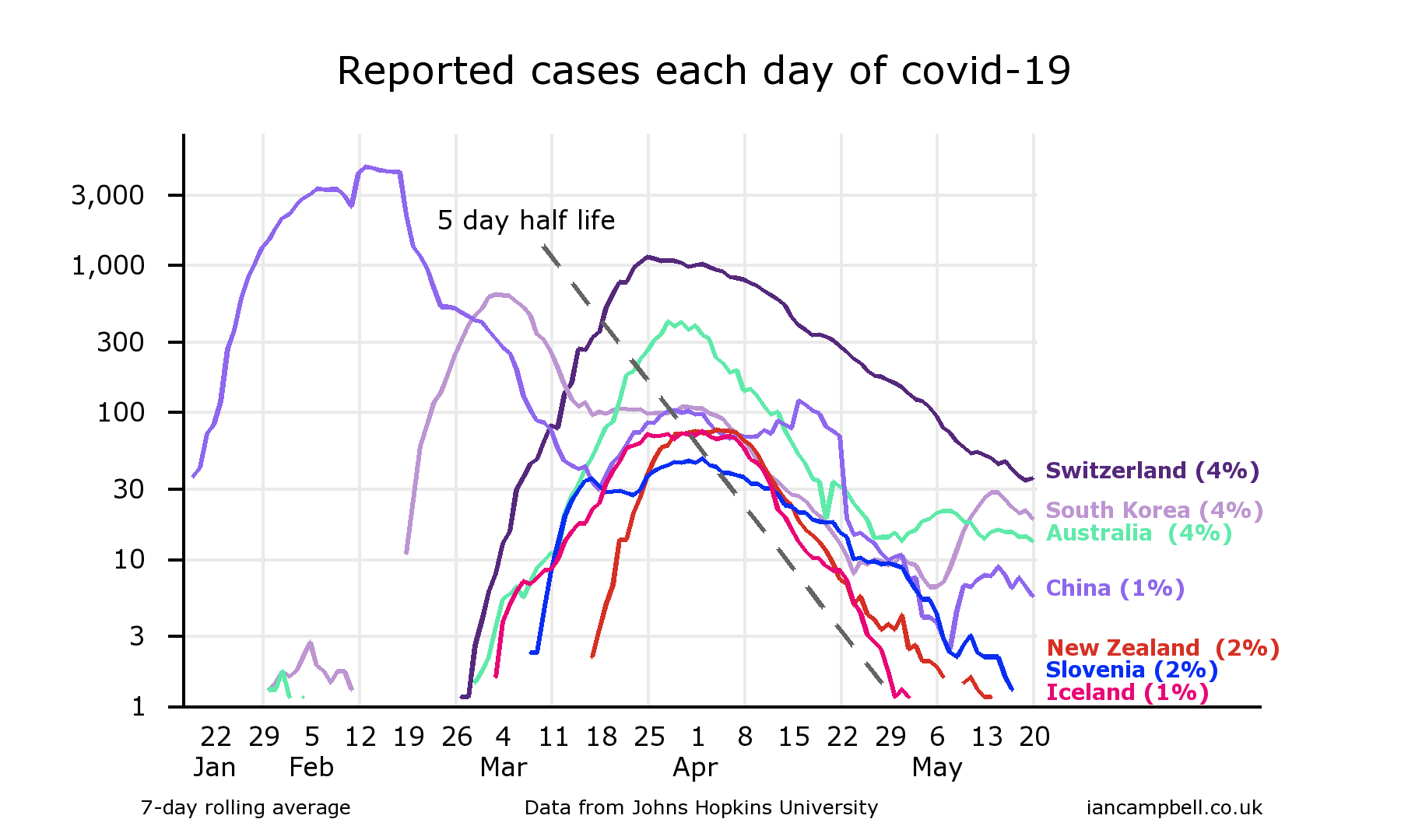
Countries with the best covid-19 control: half-lives of 5 days
The first chart shows the new cases reported in seven countries that have done well in controlling their covid-19 outbreaks - they have all reduced the rate to less than 5% of the peak rate (the percentage shown against each country is the latest rate as a percentage of the peak rate).
South Korea and China have had some secondary spikes, but appear to be dealing with them well. (The y-axis is logarithmic.)
By eye, there appears to be a similar decline in rates in many of the countries: the declines are approximately straight line, and the slopes of decline are approximately parallel. As the y-axis scale is logarithmic, this means that the declines are approximately exponential, with a similar half life. Measurement of the slope of decline indicates half-lives of about 5 days, which is equivalent to about 13% per day, and to a reduction to 1/1000th after 50 days (10 half-lives).
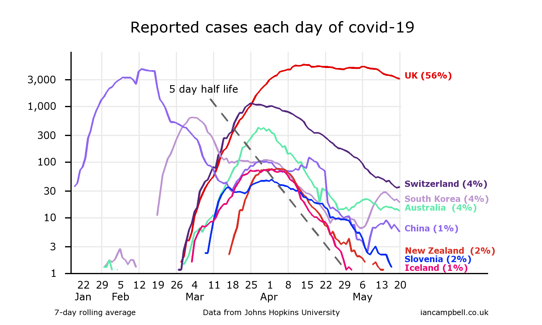
The UK is included included in the third chart for comparison. The UK Government could have made the same choices as South Korea, Australia, New Zealand and others - but its actions were too little and too slow.
The UK rate is now the fourth worst in the world, and it is declining only slowly.
The chart was generated by the online chart-drawing facility at https://www.iancampbell.co.uk/covid-19.php. Up-to-date charts can be obtained from there.
The data comes from the Johns Hopkins Hospital website [1].
Note on logarithmic scales
The charts are shown with logarithmic y axis scales. These compress large values and stretch out small values so it is easier to see the detail in the small numbers.They are widely used in situation like this where there is information in both small and large numbers.
References
| [1] | Data sources https://www.iancampbell.co.uk/covid-19/8.html |
First published: 21 Apr 2020
Last updated: 2 Jul 2020
Summary The toll of deaths and other consequences Deaths per day New cases per day UK "Global Death Comparison" chart UK nation and regional comparisons Poor UK Government decision making NHS/PHE labs are being denied testing reagents Unspecified case location in 70% of UK cases Problems with the covid-19 science Problems with the media and covid-19 Reasons to be concerned Reporting delays in Liverpool for covid-19 tests Action needed Elimination of the virus ("Zero covid") Elimination successes Population ("herd") immunity Countries with the best covid-19 control: half-lives of 5 days When to end the UK lockdown Predicting epidemics - Q and A R values, doubling times and halving times Data sources Data sources for covid-19.php Seven principles of public life in the UK Myths and misinformation About